Article
Best Practices in Design for Clinical Trial Communications: The Mysterious Art of Typography
By CISCRP Staff|May 31, 2023
By CISCRP Staff|May 31, 2023

Typography in Clinical Trial Communications
Written by: Paul Hurd
CISCRP produces a wide range of patient-friendly materials, such as informed consent forms, brochures, and trial summaries. These communications provide important information to clinical trial participants or potential participants.
These documents are written in plain language and are graphically designed to be easily read and understood by a wide variety of people. Plain language strives to be easy to read, understand, and use. It avoids complex language and jargon. To aid in readability, formatting and typography play a large part in the design process.
To learn more about these document types and to see examples, click below:
Typography is the arrangement of type to make written language legible, readable, and appealing when displayed. This blog will focus on what makes typography work to achieve these goals. But first, some definitions.
Typeface vs. Font
Simply put, a typeface is a collection of fonts. A typeface defines a type’s general shape and design. Typefaces have names such as Arial, Helvetica, or Times New Roman. The font is the type size in points, weight (regular, bold), style (italic, condensed), and so forth of the typeface when it is used. But don’t worry if you can’t remember when to use the terms font or typeface. These days, people use the terms interchangeably.
In typography, bigger is better for creating legible text. Here at CISCRP, font sizes for paragraph text are generally 12 to 14 points. The bold font style is used to emphasize important information. Though an italic font may catch your eye, it is not used for emphasis because the slanted and distorted letterforms tend to inhibit legibility. ALL CAPITAL LETTERS ARE ALSO AVOIDED because they are difficult to read with their lack of ascenders and descenders. AND IT MAY SEEM LIKE YOU ARE YELLING.
Legibility is a result of the chosen typeface and font, its size, its spacing, and the contrast between text and background. It can also be affected by the layout of the text, such as the text orientation and length of lines.
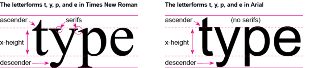
Serif and Sans-Serif type
Serif typefaces have flared ends and corners. An example of a serif typeface is Times New Roman. Serifs are as old as written language and have been traced back to the Latin alphabet. Typefaces with no serifs are called sans-serifs. Arial is a sans-serif typeface. The earliest use of sans-serif type appears in printed media as early as 1805. In general, it is best to use a sans-serif typeface, especially in paragraph text. Studies have shown that sans-serif type aids legibility among people who are dyslexic.1,2
Is it pronounced leading, or leading?
Leading (“Leh-ding”) is the space between lines of text in a paragraph. The term comes from the early days when type was made of little blocks of metal. Leading (actual slivers of lead) was used to space the lines of words and letters from each other on the page before it was printed.
Normally, leading is set at 1.2 times the type size. So, a paragraph of 12-point type size would have each line spaced 14.4 points from each other, depending on the size of the type and letterform characteristics. Confusing? Yes, but you don’t have to remember that, either. Document and page layout programs already do that calculation for you.
What you should know is that for increased legibility, leading should be set higher than 1.2 times the type size. There is a “sweet spot” where the leading size increases readability and comprehension. This is especially important for people with dyslexia. Paragraphs with a leading size too small may look like a solid block. Too large a leading size and the readers’ eyes jump from one line to another and have trouble finding the next line. Again, this amount of leading varies by type size and what the letterform looks like. How much leading is just right? That is part of the “mysterious art of graphic design.” Not really. Experts recommend a leading of 1.5 times (150%) of the type size. For instance, a 12-point type size would have a leading space of 18 points. See the figure below for how this would look using the Avenir typeface.
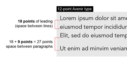
Spacing between paragraphs is another important design consideration. Space between paragraphs is just as it sounds. It is white space, sometimes called a “carriage return,” between paragraphs. How do you know what size space should be used between paragraphs? A good rule to follow is that the space between paragraphs should be a little less than 2 times the leading. For instance, in the figure above, paragraphs of Avenir 12-point type would be spaced an additional 9 points from each other. Think of the measurement as 27 points of leading between paragraphs.
Here are some other considerations for readability in lines of text:
Type size, leading, and spacing between paragraphs is calculated to make use of white space or “negative space”. Why white space is important and how it aids in legibility will be explored in a future post.
In conclusion, when it comes to readability, the care you take with typography in a document can be just as important to plain language as the actual words.
Along with our plain language expertise, the legibility and accessibility of our printed and online educational and patient-facing materials are designed with the goal of improving participants’ experience in all stages of clinical research.
References